Case
Improving an old mobile user interface requires a user-centered approach, which includes gathering user feedback, analyzing the current state, designing, user testing, and continuous development. By following these steps, you can create a user interface that is modern, intuitive, and meets users' needs.
The financial management concept of the new mobile interface, "Finance in Your Pocket," focuses on user-friendliness, real-time functionality, and automation. It provides comprehensive tools for managing finances in a single app, making it an attractive option for small and medium-sized businesses as well as freelancers.
To understand the features and customer experiences offered by competitors in order to differentiate our product in the market.

Competitor Analysis: Mobile Financial Management Products
Direct Competitors:
Mobile app providing comprehensive financial management services for small and medium-sized businesses, including Netvisor Heeroes and Passeli.
Indirect Competitors:
Traditional financial management services that do not offer mobile interfaces.
Data Collection
Not direct competitors
Ukko: Financial management app specifically designed for freelancers.
Websites:
Analyze the information and user interfaces provided on competitors' websites.
Customer Reviews: Read reviews from app stores (App Store, Google Play) and forums to gather insights into user experiences.
Define scope
Prioritize Features
I conducted a workshop to identify the essential features for the mobile application MVP, or Minimum Viable Product. I focused on pinpointing features that would deliver the most value to users with a streamlined implementation. My goal was to define the development scope to create a functional core version of the application within a short timeline, focusing solely on essential functionalities.
I focused on identifying additional features that would complement the MVP and provide users with added value over the long term. This allowed me to build a development roadmap for the application, with features scheduled for controlled release after the MVP
Sketch:
My colleague and I sketched these ideas together, visualizing various concepts for the financial management application. Collaborating allowed us to gain diverse perspectives and ideas that enriched the process. This enabled us to better select and develop the best ideas for further work.
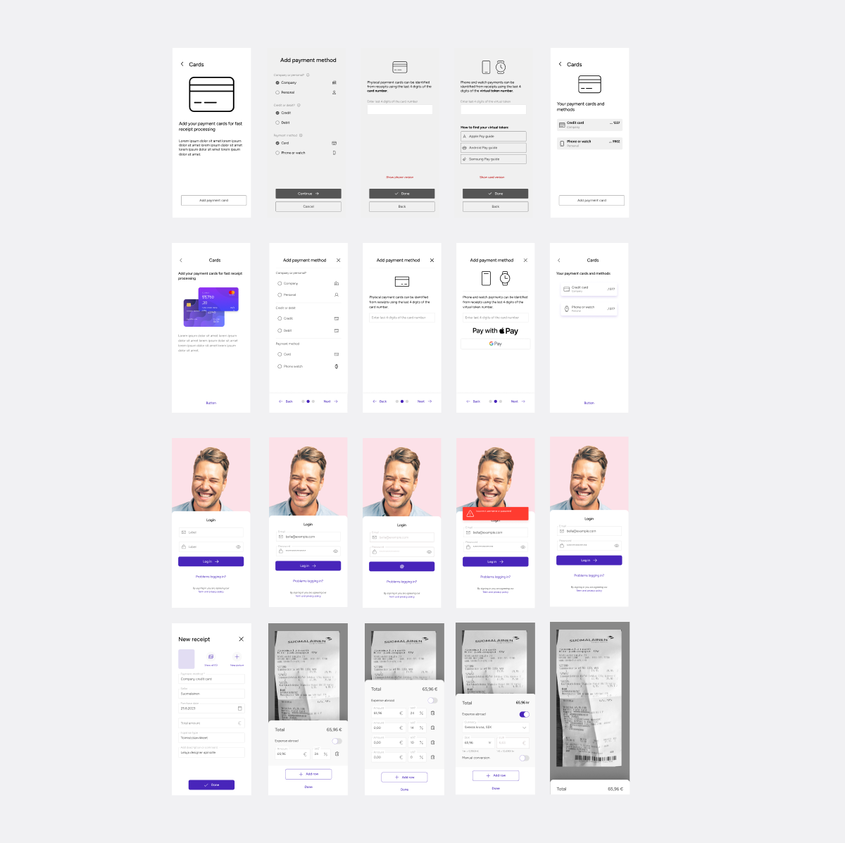
Prototype
A prototype was created from the concept ideas, which was tested with stakeholders. The testing provided valuable feedback that helped us identify strengths and areas for improvement. This interaction with stakeholders ensures that the prototype meets users' needs and expectations before the actual development work begins.

Onboarding
My goal is to help as many users as possible, especially those using my app for the first time. I have designed an onboarding presentation that guides users through the app’s functionalities, making the experience smoother and more enjoyable. I want to ensure that every user feels confident and can get the most out of the app right from the start.

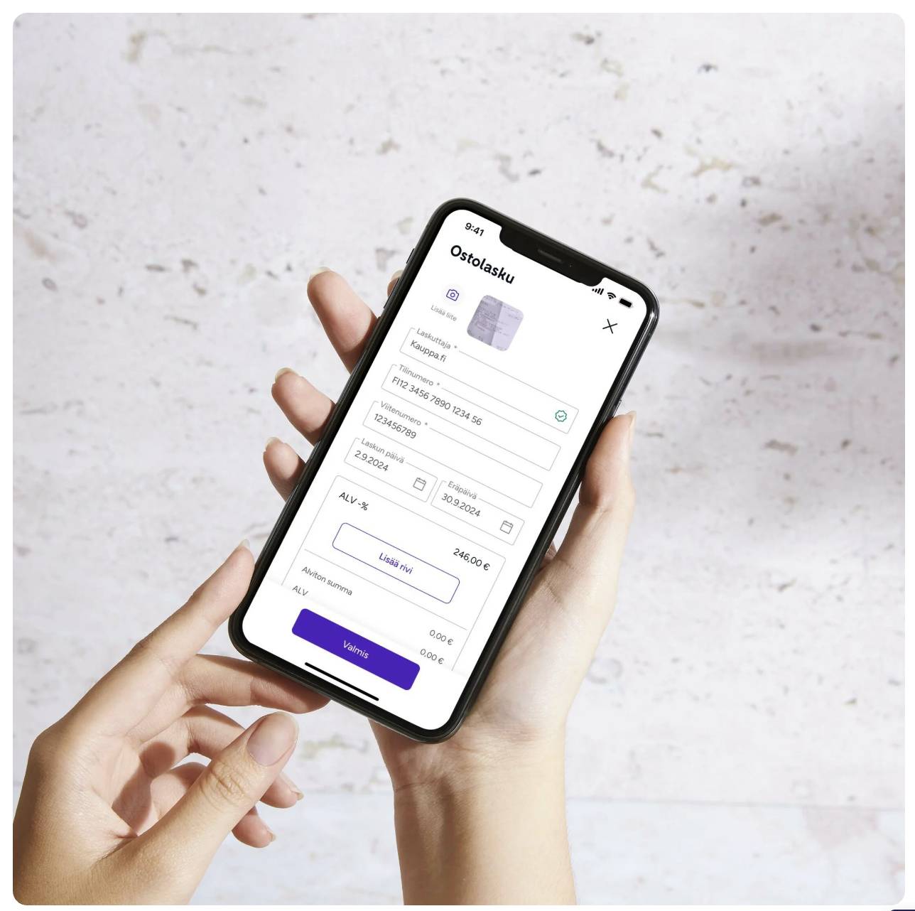
Receipt
In the new financial management mobile app, taking a receipt is easy and quick. Users can capture a receipt in just a few simple steps, making bookkeeping effortless and efficient.
We aimed to make this app as accessible as possible, so that all users can enjoy a smooth experience without unnecessary hassle.

Add new travel
I created a new user interface for the travel expense app, using a wizard function to help users navigate easily. This makes it simple for customers to move forward and use the app effortlessly. That makes the user experience as smooth and user-friendly as possible.

Design system
We built the design system ourselves, using only the company's fonts and brand colors. This approach allowed us to ensure that all user interface components, such as buttons, forms, and colors, are consistent and support our brand identity.
With the design system, we created an efficient and flexible foundation that facilitates future developments and ensures a consistent user experience across all parts of the app.

Rating
Our app's rating has increased from **1.1** to an impressive **4.5** stars after we made significant improvements to the user interface. These changes have received positive feedback from our users and have been a key factor in enhancing the overall user experience and boosting the app's popularity.