Pictue
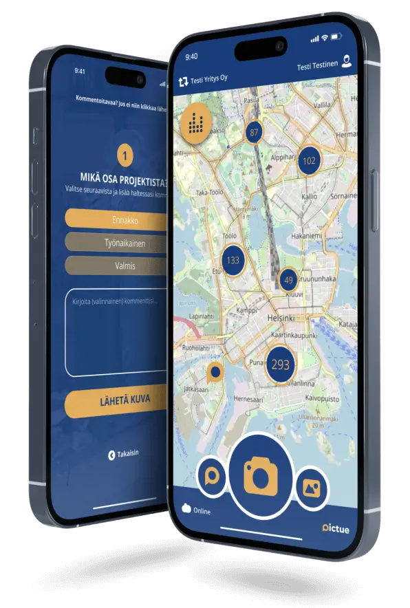
Pictue is a Finnish application designed primarily for service industries, such as construction, cleaning, and other sectors where capturing images and documentation are essential tasks. The goal of the app is to make it easier to define and manage work processes, especially in terms of capturing images and documenting progress.
The app allows users to take photos and directly link them to specific tasks, enabling service industry workers to document their work in real time and with precision. This is particularly useful in industries like construction, where it’s important to document work stages and ensure that all tasks are completed correctly.
Pictue may also include reporting tools and analytics that help organizations track workflows and improve process efficiency. By combining visual documentation with task management, Pictue provides an easy-to-use tool that enhances transparency and quality in work processes.
My role
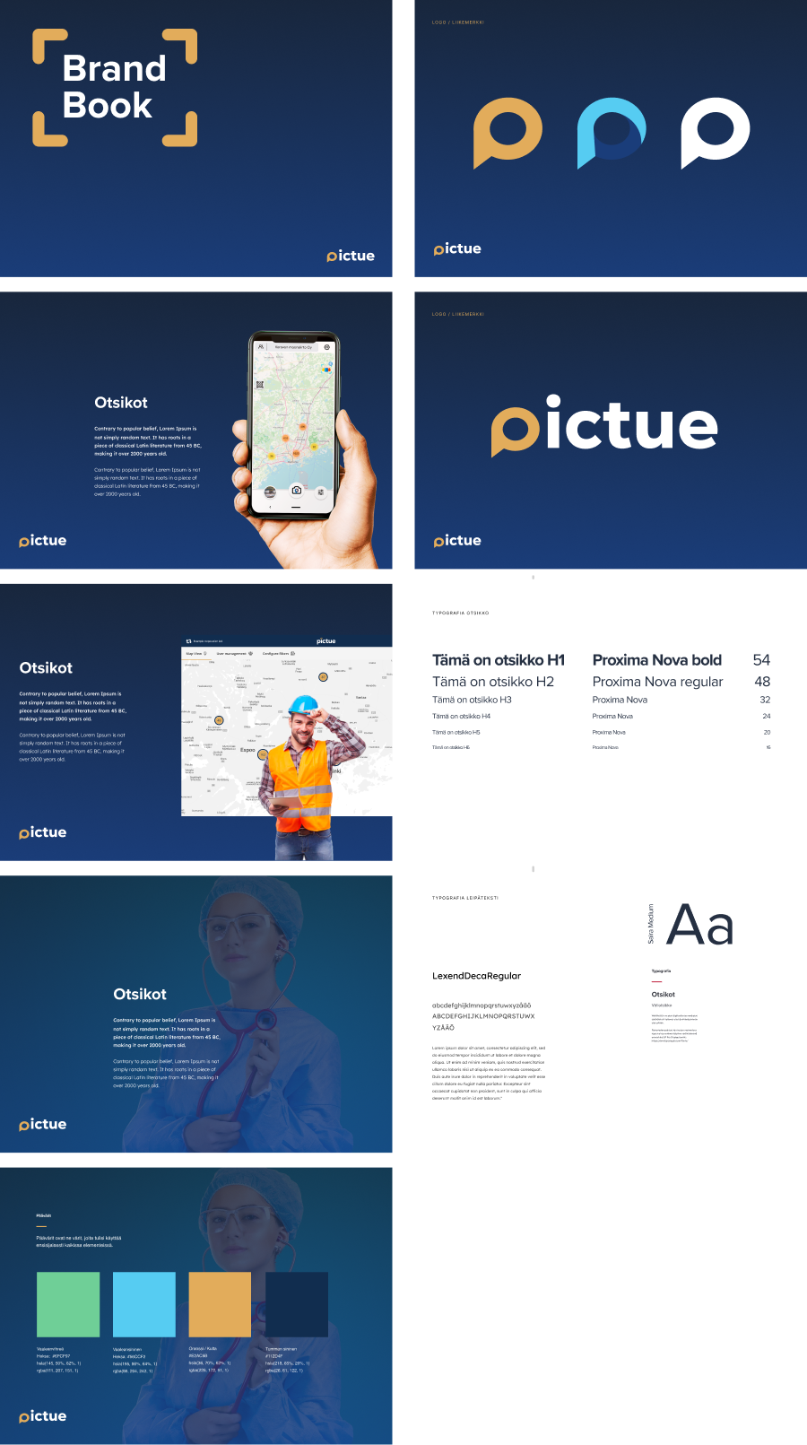
I designed a small-scale **Brand Book** for Pictue, which defines the brand's visual identity and communication style. The Brand Book includes guidelines for logo usage, color palette, typography, imagery, and brand voice. It ensures that the brand remains consistent across all channels, whether it's for the website, the app, or marketing materials.
I was also involved in front-end development work and helped design the dashboard interface. For this project, we used **Vaadin**, which presented its own challenges – particularly in terms of making changes, as the platform was quite rigid and difficult to modify. Vaadin is a powerful tool, but its structure and components somewhat limit customization, especially when trying to adhere strictly to the visual guidelines set in the Brand Book. Using **CSS** was crucial in ensuring that the app's appearance aligned with the brand's defined colors, fonts, and overall style.
With **CSS**, we defined the brand's colors and fonts, which were applied consistently throughout the interface. Additionally, the placement of the logo and the presentation of images were adjusted using CSS to align with the Brand Book's guidelines. Vaadin made this a bit challenging, but in the end, we were able to create a visually consistent and functional interface that supports Pictue's brand.