Case study Ecom

At Accountor, I worked on a construction project management and financial application.

Before the first meeting, I identified the pain points and usability issues I found in the application. I conducted a Nielsen heuristic evaluation and presented my findings to the client.

During the design process, I focused on the user reports we received and the various user profiles. Right from the start, I noticed that the application was too complex and broad from a usability standpoint. I decided to focus on a few key features and keep the concept reasonably sized by addressing only the most critical problem areas.

My work was mostly independent, but once a week, I held a workshop at the client's premises where we reviewed new plans and design ideas. I also created prototypes for new components and visual updates to better demonstrate improvements and ideas to the client.
Case

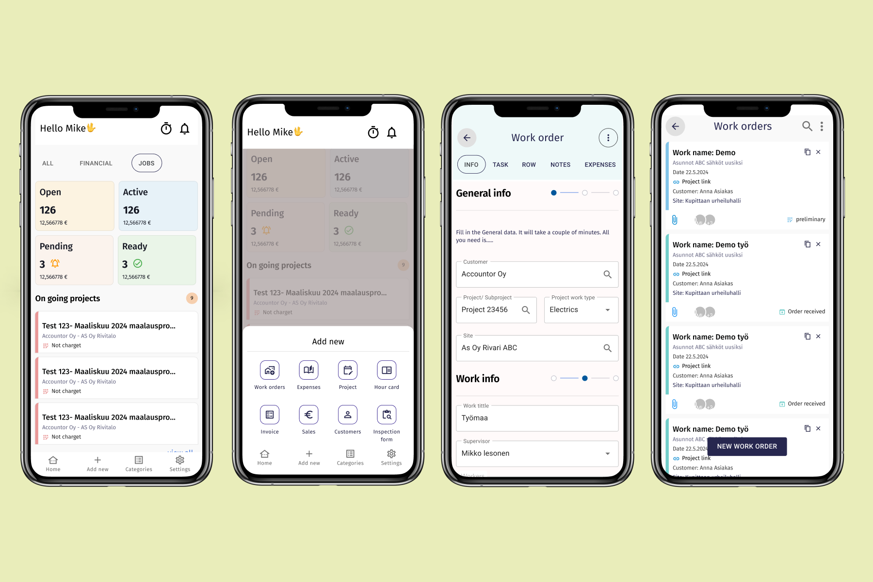
I improved the client's mobile app, which was difficult to navigate and had many usability issues. When I started, the concept was confusing, making the user experience challenging. My goal was to clarify the interface and enhance navigation so that users could easily find what they needed.

I created new components that clarified the user experience and made the app more intuitive to use. These components, such as clearly distinguishable buttons, informative alerts, and logical menu structures, helped users navigate the app smoothly and efficiently.

Features Improved:

Redesign of the Top Navigation: I redesigned the top navigation because it wasn't functioning well on mobile devices. This enhanced user-friendliness and made navigation easier.

Fixing Pop-up Windows: The app had pop-up windows that prevented users from moving forward and confused the overall user experience. We addressed these issues, as they posed a significant threat to usability.

Clearer Navigation Options: I designed clearer navigation options so that users can easily find the functions they need.

Universal List Component: I built a component that functions scalably across different sizes of applications and various use cases.

Project Phase Indicator: I added an indicator to the list component that shows what stage the project is currently in. This helps users easily track progress.

Removal of Unnecessary Rows: I removed unnecessary rows from the old list component, making the list clearer and easier to navigate.

Color-Coded Indicator: I implemented an indicator in the list component that uses colors to show the project's current phase. This visual element helps users quickly understand the project's status.

Old Pwa app

The old user interface was outdated and confusing, operating on the WPA platform. It closely mirrored the desktop version, which was impractical for mobile use. This led to users finding the app difficult to navigate and its functions unclear. My goal was to differentiate the usability of the mobile and desktop versions, allowing the app to provide a better and smoother experience for mobile users.

Wireframes

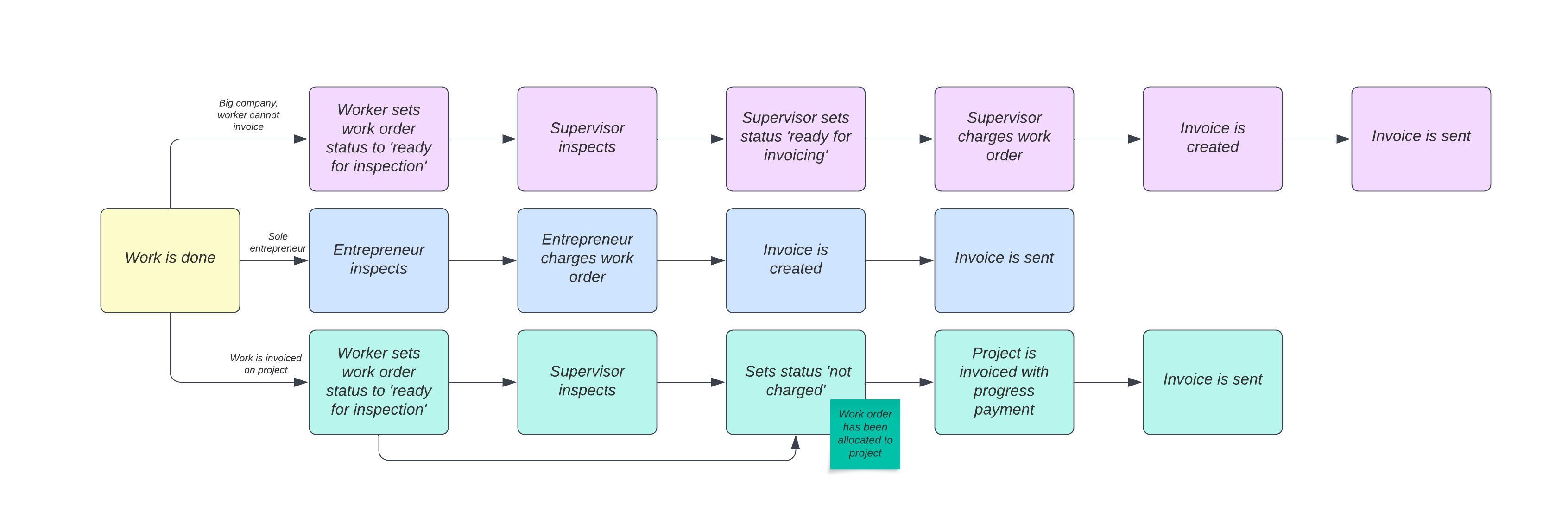
I created a few wireframes and identified the key pain points in the app. I analyzed the user experience and pinpointed the areas that caused the most issues for users. Based on this, I designed proposed solutions. Additionally, it was important to scope the project within certain parameters so that we could focus on the essential improvements and ensure that the development remained manageable. This scoping helped the team prioritize tasks and break the project into phases, making the development process more efficient.

User profiles

We scoped the project down to a smaller scale and decided to focus on a few user profiles and improving the user experience. This allowed us to dive deeper into the needs and specific challenges faced by users within the app. We aimed to address issues that were particularly relevant to certain user groups, enabling us to create targeted improvements and enhance the overall user experience

Light Design system

The new elements were designed within a comprehensive design system in Figma, ensuring consistency across the application. These elements were built as reusable components, allowing for easy implementation into the code later on. The system included standardized components like buttons, forms, and navigation elements, making the app more cohesive and easier to maintain as it scaled.

Back to projects